Maple reimagined
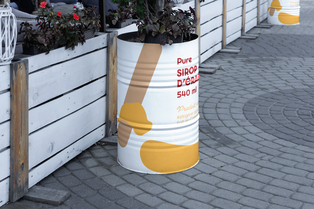
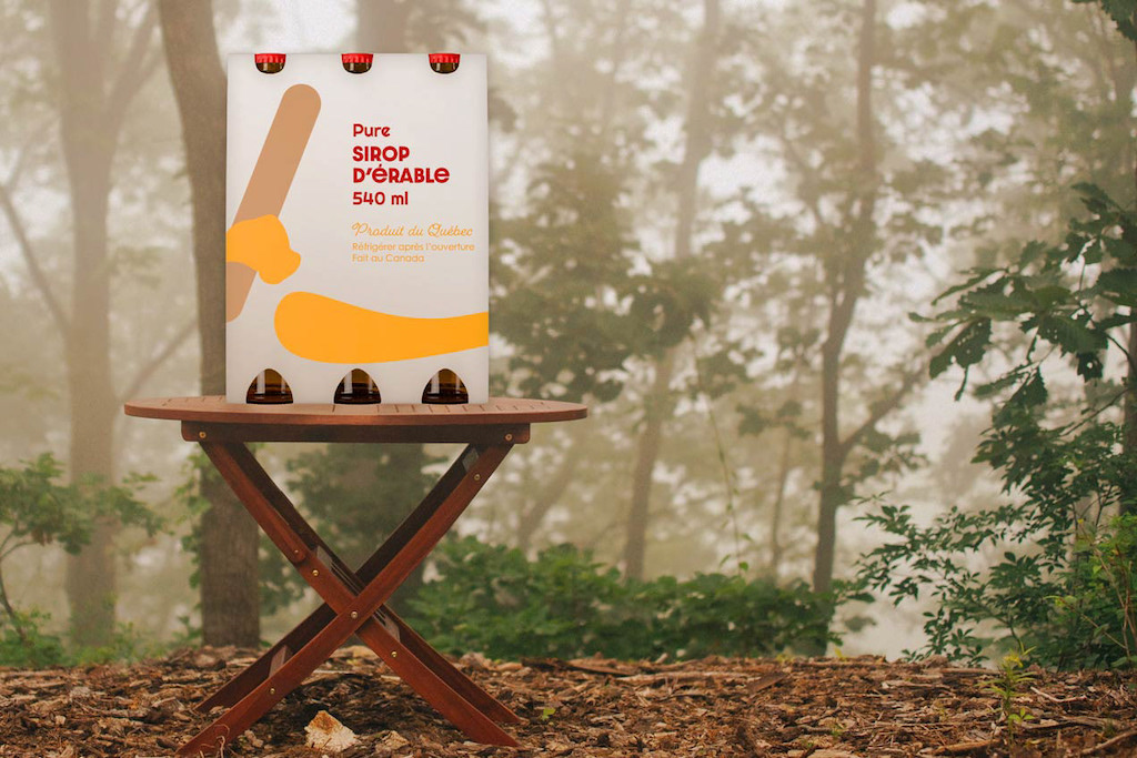
Package design for a fictional, maple syrup company. Concept one, is a re-branding of the ol’ timely Québecois scene, with an updated, modern vibe. A vibrant twist of the sugar shack experience. The second concept is a fun, clean, flat design representing the very sweet and joyful act of sharing hot taffy, poured and cooled on the snow.
Packaging – Collège Lasalle 2022
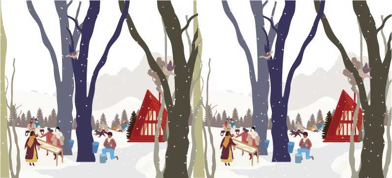
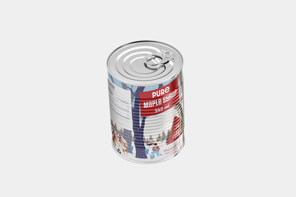
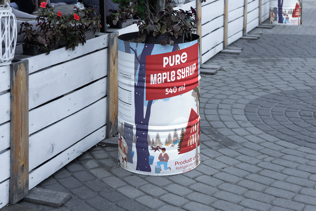
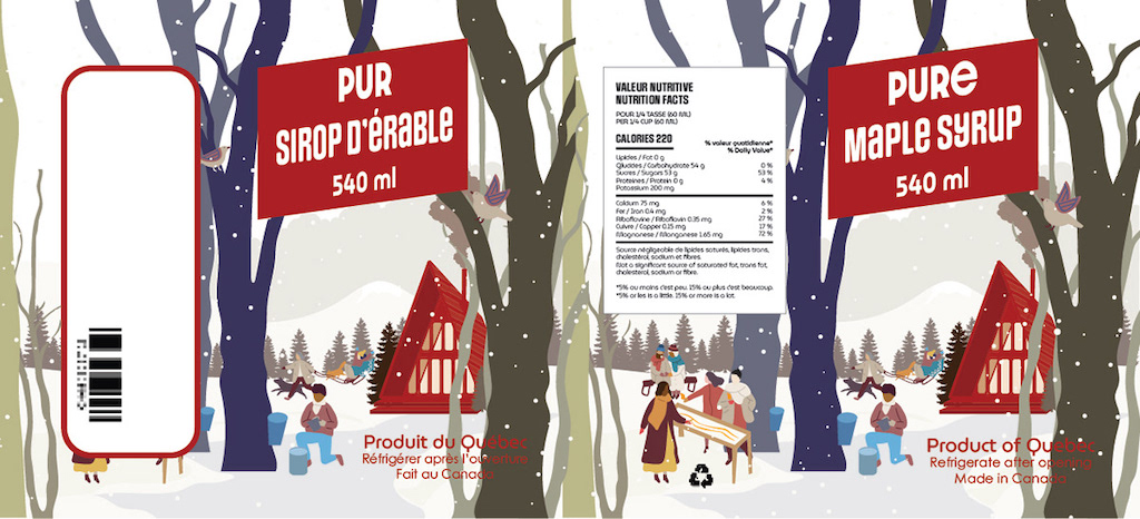
Concept 1 – Redesign of the traditional sugar shack scene
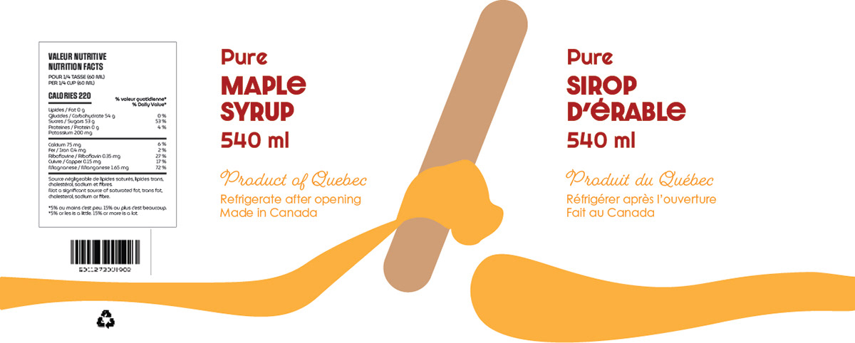
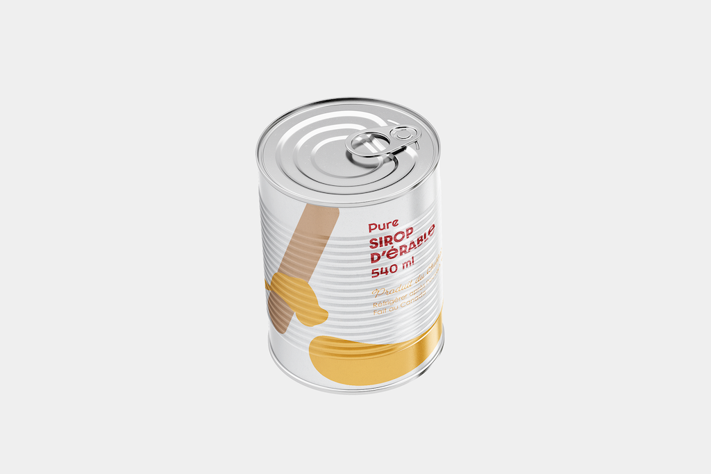
Concept 2 – Modern flat design
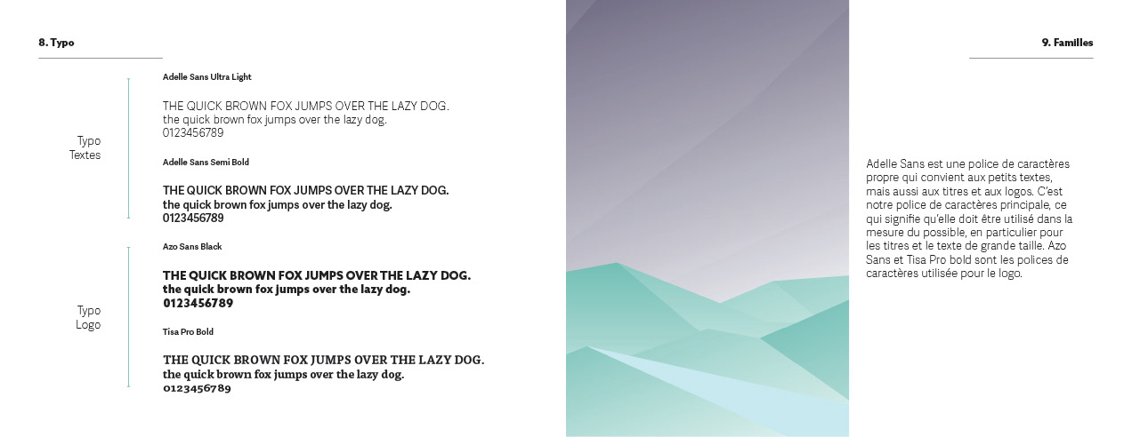
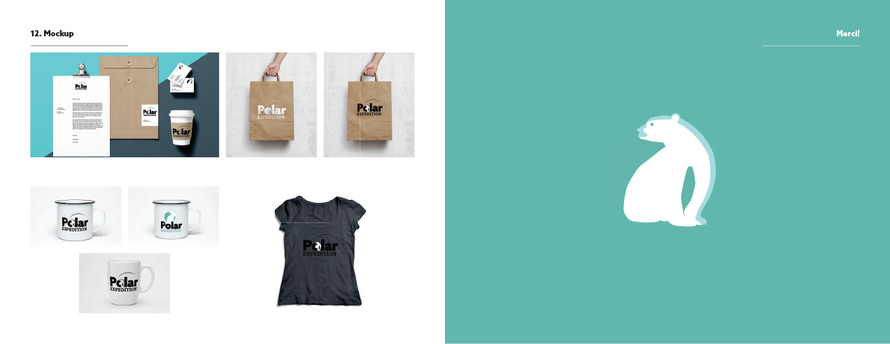
Logo Revision
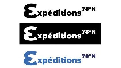
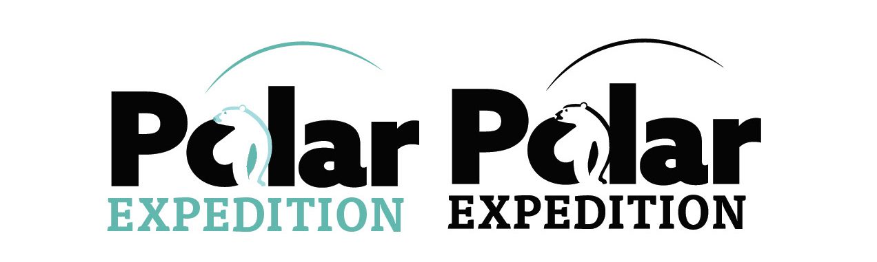
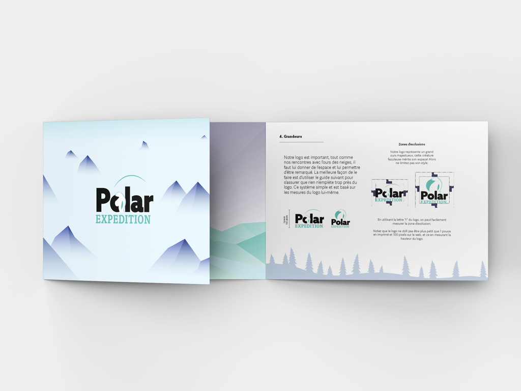
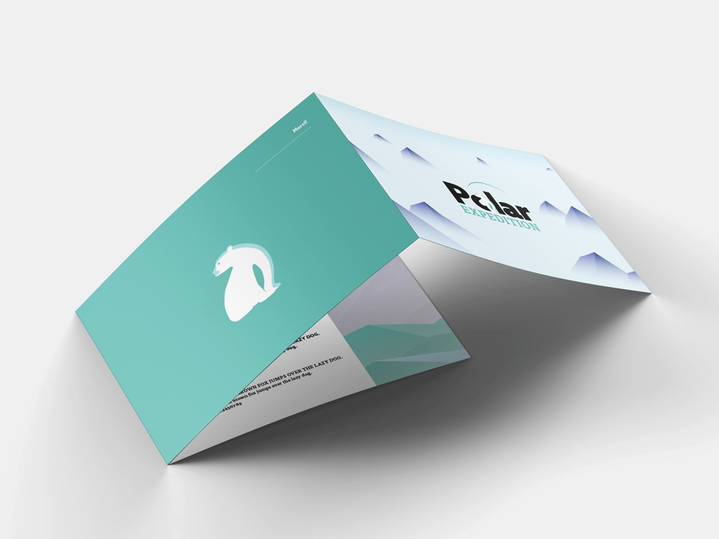
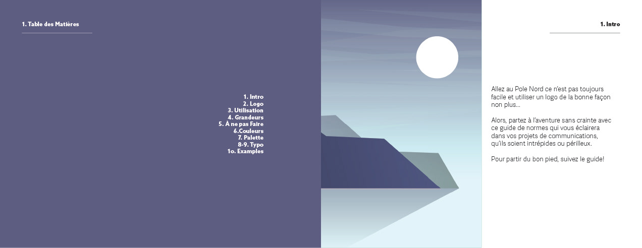
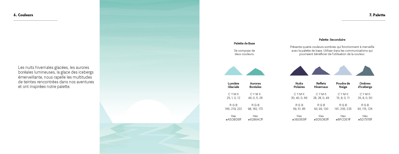
Expedition rebranding
Logo redesign for a fictional Nordic tour company, including new brand guidelines. A revamp that will invoke the mystique of that chance polar bear sighting, coming out of his lair, sniffing the air, is that a solar flare?… Designed with crisp glacier colours and “breath of fresh air” typography.
Visual Conception – Collège Lasalle 2021